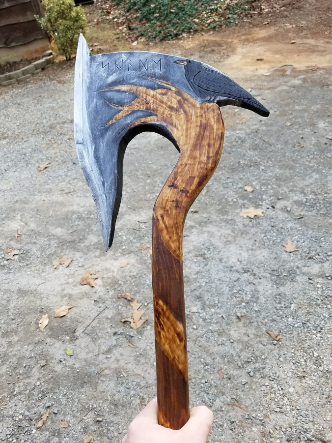
This is the second axe I’ve made, so I came into this one a little bit more confident. Actually,this is the first project that I’ve had a complete idea of what I wanted it to look like.
I sketched a few different ideas out, and finally landed on this one. The writing on it is kind of a Norse script that Tolkien adopted for his maps of middle earth when he was writing his books. I came across it and thought that it added to it and that it might make it seem older.
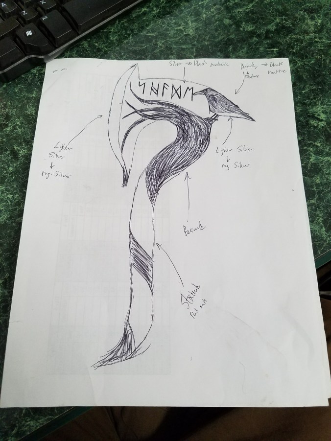
Sketch of Axe
From there I redrew the axe with actual dimensions on the wood. I hadn’t planned on making this blog at the time, so I don’t have a picture of it before I cut it out. You can still see some of my lines that I had drawn on the axe to get the right dimensions.
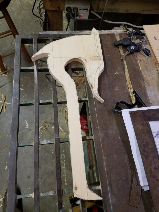
When working on something like this, I start by measuring to get the general shape, and then free hand the details like the curve on the blade or the bird. It can take a little while for me to get the right look, but I think some of that is because I’m new to all of this.
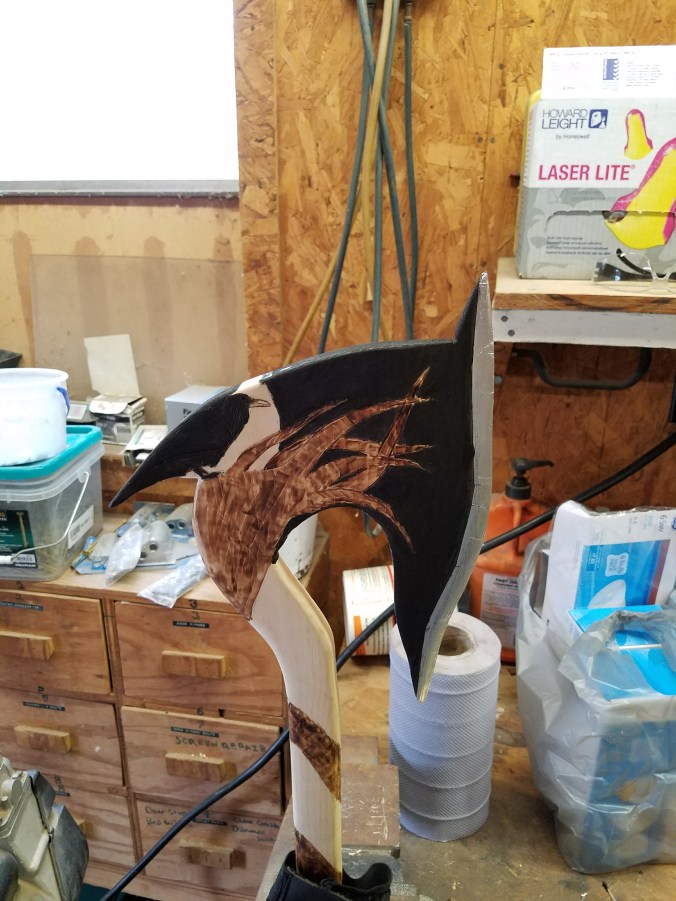
After cutting, I sanded it up and drew some of the more detailed image. This was kind of tricky for me, because I’m not used to having to reproduce an image, so the bird took a while.

I decided that the tree/ branch would look pretty cool burned in, so I spent an hour or two burning it. Normally, I would try to texture it a bit more like a tree, but I lost a bit for my wood burner, so I ended up going for a marbled look. I had to switch bits once or twice for getting the smaller branches, so I took a few more pictures. I also put a few lines on the bird to give it some texture once it was painted.


From here I took a break from this project for a while until I could figure out what kind of paint I should use. I also put on some aluminum tape that is used for duct work on the edge because it gives a much more realistic shine when you brush it together with some steel wool. I think the effect is best achieved if you use it all over the blade and then put on the specific details later though. The last axe I made had a kind of stone look after I was done, and I wanted this to come out a little more metallic. I ended up deciding to go with a metallic black acryllic. It turned out ok, but not exactly what I was hoping for.
I decided to leave a little space between the black and the crow so that it didn’t just blend together. Eventually I painted the circle around it silver.

Now I mostly was just trying to distress it a bit and shade some of it together because everything about it was a little too stark. I ended up blending the black and gray together and leaving the crow solid black. 
I think if I had to make this again, I would have started with the aluminum tape and taped everything and brushed it together. Then maybe cut out the branches from the tape using a knife and then burned them in. Everything is a process though, and learning from your mistakes to make the next thing better is just part of that.Overall, it still looks pretty cool though.
I then stained the rest of the wood, let it dry and put on a clear coat to help preserve it.